


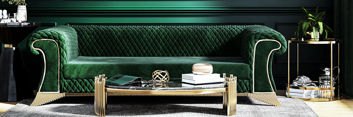

Shades of green, styled to perfection.

Photo Credit:Farid Ahmad/iStock
Florence’s Palazzo Pitti, which dates back to the Italian Renaissance, has its Green Room,resplendent with green silk walls, curtains, and upholstery. Elsie de Wolfe used bright green along with trellises to give a garden-party air to the meeting rooms of New York’s Colony Club. Yves Saint-Laurent and Pierre Bergé incorporated varying shades of green throughout Dar Es Saada, their Marrakech home, to replicate the lushness of the surrounding gardens. In short, green interiors have long been a feature of enviable homes, and green interior design continues to feel fresh and fashion-forward.

Photo Credit: Costas Picadas/Gap Interiors
The roots of green interior design
Green has long been associated with nature and fecundity. Ancient Egyptians painted the god Osiris with green skin—often using pigments made from malachite—because he symbolized rebirth. Women in many medieval and Renaissance paintings are garbed in green as a nod to their fertility. The Art Nouveau movement of the late 19th and early 20th centuries, which drew inspiration from nature, led to a resurgence in the popularity of green decor. And today’s increased focus on bringing the beauty of the outdoors into the home once again has designers and tastemakers incorporating not only live greenery but also green textiles and accessories into rooms.

Photo Credit:Rowena Naylor/Stocksy United
The variety of green hues ensures that the color works inrooms of just about every style.Martyn Lawrence Bullardlacquered the family room walls of a Mid-Century Modern home shamrock green to complement the mod green chairs that pay homage to the house’s architecture; he then papered a bedroom’s walls with an equally vivid green frond print in reference to its Palm Springs locale.
In an American Colonial Revival home,Corey Damen Jenkins lacquered columns and ornate millwork lime green, giving the space a 21st-century update while accentuating its neoclassical elegance.
Master of modern opulenceKen Fulk used malachite-patterned wallpaper and emerald-green velvet banquettes to bestow San Francisco’s Sequoia Cocktail Club with Art Deco glamour.
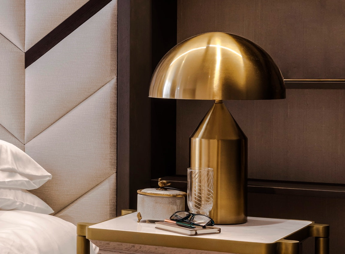
Many designers, includingJayne Design Studio andTodd Klein, use paler hues such asmint to refresh traditional spaces while maintaining a sense of serenity, just as others incorporatesage green to reinforce a sense of quiet luxury.
A little or a lot?
You don’t have to go all in with green to revitalize a room. Even just a touch or two can breathe new life into a space—though don’t be surprised if you find yourself craving more. Green can be quite addictive that way.

Photo Credit:Viktoriia Lytvyn/Stocksy United
Easing into green
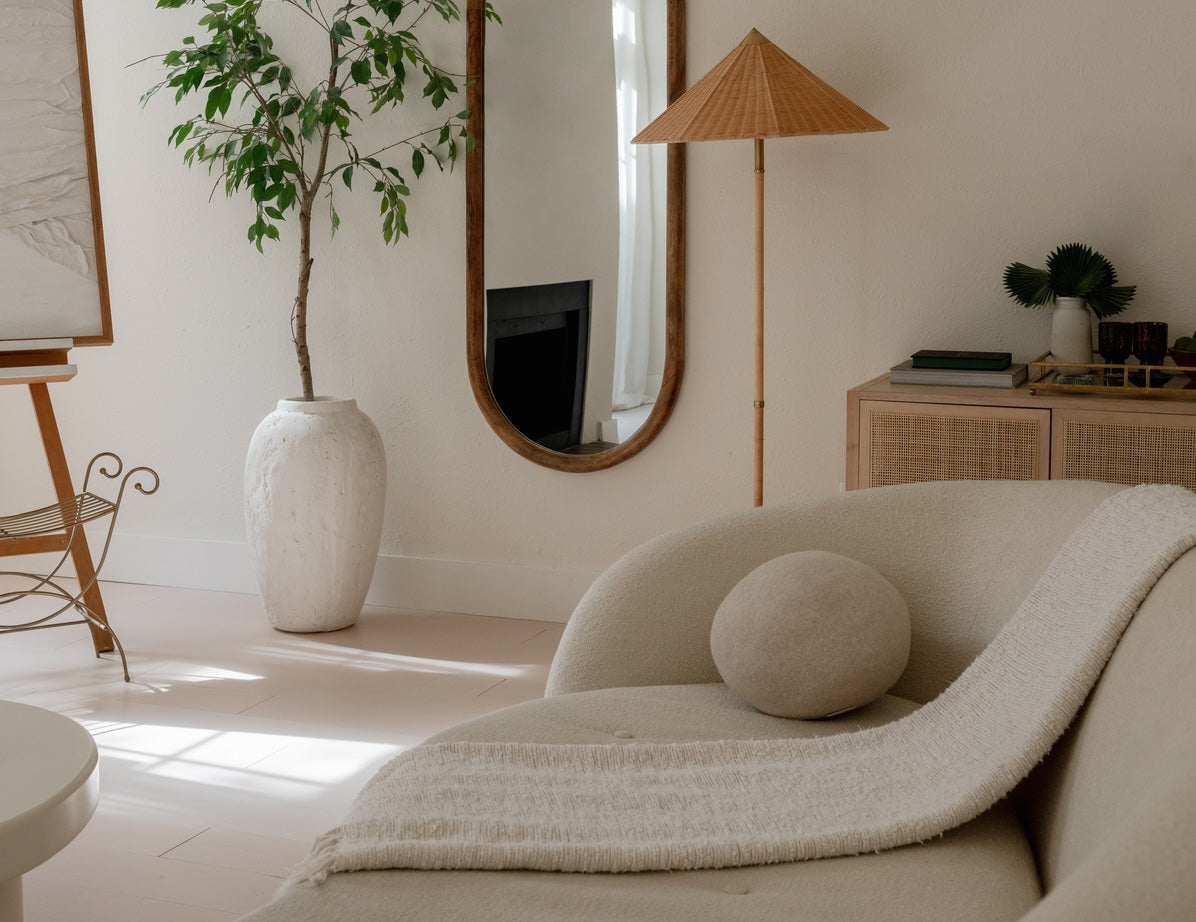
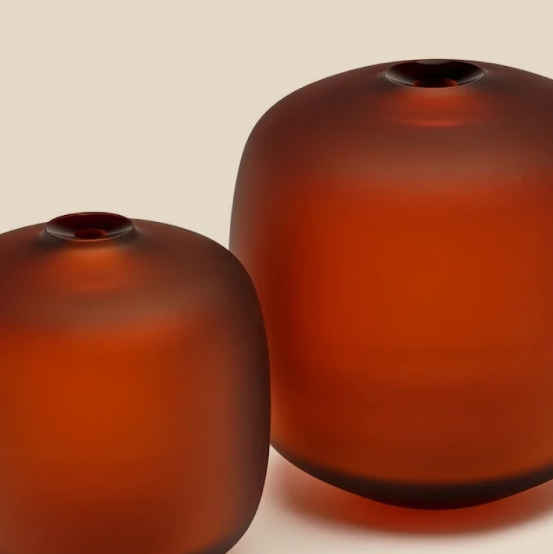
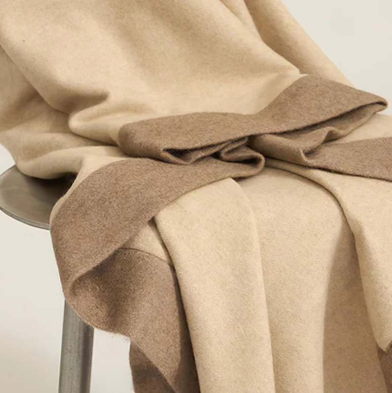
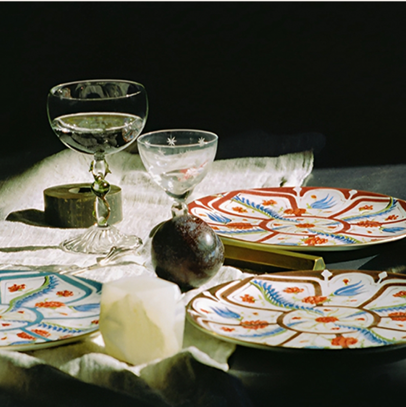
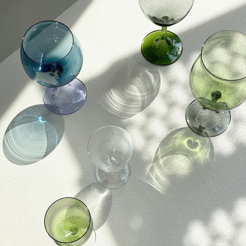
If in doubt, start small with one or two accents in a room. In terms of bedroom decor, green glass vases atop a dresser or a jade-green cashmere throw offers an instant update. For green living room decor, try a shagreen decorative box or a tray made with green marble. Dress up your dining room with seafoam glassware or chairs upholstered in emerald velvet, or sheath your bathroom with sage-green shower tiles. And don’t forget greenery, perhaps the easiest—and certainly the most natural—way to go green.

Photo Credit:VISUAL SPECTRUM/Stocksy United
A little more green
Window treatments are a simple and stylish way to ramp up a room’s verdant levels. Velvet curtains in bottle green exemplify opulence. Another option is pale green curtain sheers, either alone or layered beneath heavier damask draperies. More commonly seen in Europe, layering thicker curtains atop sheers gives you greater control of the amount of daylight you let into a room and also helps mitigate fading of upholstery and art due to UV rays.
An effortless way to give green more presence in a room is to lay down a green rug. Many Oriental rugs have grounds ranging from soft olive to deep forest green; even in a sleek contemporary room, a classic rug imparts a welcome timelessness. Or go with a modern rug that incorporates bold green in a geometric motif, certain to invigorate a space.

Photo Credit: Viktoriia Lytvyn/Stocksy United
Rugs aren’t the only foundational element that gracefully introduces green to a room. Many designers now treat moss, olive, and emerald green sofas, chairs, and headboards as fundamentals. In a primarily neutral room rich in rattan, sisal, and pale wood, a green sofa provides an ideal pop of color that fits right in with the surrounding organic elegance. Conversely, green seating, particularly dark green velvet or leather, will evoke moody romance. And don’t overlook the power of green throw pillows to enliven a room. Dark green velvet conjures luxe coziness for winter, just as light green linen evokes the sunny joys of spring. You can then complement either option with a green print, be it a traditional floral or anop-art pattern for a Mid-Century Modern vibe.
Artworks allow you to bring a green vista to a room. An oversize art photo of a meadow or a forest can compensate for a less-than-stellar view outside your windows, or even for a lack of windows. Abstract paintings that feature various green shades are another option—the palettes of such works can also help inspire the palette of your room.

Photo Credit: Julien Fernandez/Gap Interiors
Going green in a big way
Painting your walls lets you cocoon yourself with green. Keep in mind that choosing the best green for your space entails more than picking a color you love. In the Northern Hemisphere, a room with primarily Southern or Western sun exposure benefits from a cooler green—in other words, one with a blue undertone like Benjamin Moore’s Silver Marlin and Little Green’s Amberside. On the other hand, greens with a yellow undertone, such as Farrow & Ball’s Yeabridge Green and Lick’s Green 01, will warm up a room with Northern or Eastern exposure.
For more drama, consider green wallpaper. Fornasetti’s iconic Malachite in emerald is a paragon of contemporary glamour, and the numerous Morris & Co. wallpapers show just how versatile Art Nouveau motifs can be. And prints featuring palm fronds nod to Palm Beach chic and Palm Springs cool.
 Photo Credit:House & Leisure/Gap Interiors
Perhaps the most statement-making of green room decor ideas is to create an interior vertical garden. Also known as a living wall, it literally brings the outdoors in. Working with a professional is key to installing proper irrigation and protecting the integrity of the building. But transforming a wall, or even part of one, into a garden will bring a wealth of textures and green hues into your home. It will also improve the room’s air quality and can muffle outside noise. No wonder New York’sHotel Hugo, Venice’sHotel Paganelli, and Hong Kong’sHotel Icon are among the deluxe venues that have installed vertical gardens in their lobbies and breakfast rooms. (Hotel Icon’s indoor vertical garden is Asia’s largest.)
 Photo Credit:Vincent/AdobeStock
Create your perfect green palette
Science has a key role in the popularity of green interiors: Perched in the middle of the visible color spectrum, green is the easiest, least stressful color for the human eye to perceive. Another reason for the color’s popularity is that because it’s a blend of blue and yellow, green plays well in rooms that have either or both those hues. What’s more, the breadth of green hues, from soft eau de nil to neon green, all but guarantees you’ll find a shade to complement just about any style.
The plethora of options can be overwhelming, however. Here are some ways to incorporate shades of green based on your interior design style.

Photo Credit: Jodie Johnson Photography/Stocksy United
For quiet luxury: Sage and olive greens are ideal complements to the golden accents that help define the look. As with this aesthetic in general, less is more: A moss-green settee and a green Murano glass vase will bring just enough depth to the creams, grays, and other neutrals that make up the quiet luxe palette.
 Photo Credit:Max Vakhtbovycn/Pexels CC0
To create Art Deco glamour: Set off black, white, silver, and gold with emerald, chartreuse, and other bold greens. Green marble accent pieces, plush green textiles, and a green lacquered tray or box with golden trim will bring Roaring Twenties spark to your home.

Photo Credit:Num/Adobe Stock
For a garden-fresh Palm Beach feel: Mix florals and ginghams with splashes of mint or lime green. Complement with pink, coral, yellow, or crisp white. Wicker, bamboo, and rattan will add to the mood, as will leafy palm trees—either real plants or accents adorned with fronds. An exuberant peacock chair is an ideal finishing touch.
 Photo Credit:Giacomo/Adobe Stock
To evoke Mid-Century Modern chic: You can’t miss with avocado green upholstery or accents, especially in conjunction with teal, terracotta, powder blue, and beige. A sleek daybed or a minimalist ottoman upholstered in avocado leather nails the look, as do table lamps with curvy avocado ceramic bodies. If you’re up for something brighter, consider adding curvy plastic molded or acrylic chairs in grassy green around your dining or kitchen table.
Want to introduce green into your home’s palette? Explore our assortment of green decor and tableware. And for personalized design guidance, book a consultation with our Nest Casa experts.